Expert Van Sign Writing Ideas to Improve Your Service Vans
March 18, 2023 | Read: 17 minutes

We’re exploring ideas from van sign writing experts and covering all the info you need to know to improve your service van designs!
Discover how your vans can help you to make an amazing first impression…
But before we dive in, have a think:
- What do the designs on your vans say about your business?
- What do customers think when they see your brand?
- How exactly do you create a fantastic design?
To help answer these questions, we’ve collected tips from vehicle signage experts from across the globe. From discussing how much to spend, design ideas, and pitfalls to avoid, there’s a lot to learn.
Let’s dive in so you can transform your service vans into eye-catching, lead-generating machines!

Why should you care about service van design?
If you’re looking for strategies to improve sales performance then improving brand credibility and awareness can be transformative.
Here’s why you should care about van sign writing and ideas that can boost your brand:
- A well-designed service van creates confidence and trust.
- Vehicle signage deters thieves.
- Your fleet’s branding builds credibility.
- Vehicle signs reach customers where they are.
- Caring for your service fleet gives customers confidence.
- Van graphics can attract a lot of attention.
- Van graphics are cheaper than other types of advertising.
- Vehicle signage generates leads
1. A well-designed service van inspires confidence and builds trust.
“From a customer’s perspective, their concern is avoiding a ‘cowboy’. They don’t want to lose money to a trader who disappears after doing a bad job, or who doesn’t do the job at all.
Think from that perspective about how a blank van looks versus a professional van wrap.”
—Barry Gibbons, Director of Van Signs Online Ltd.
As a UK-based vehicle and van sign writing manufacturer, they know their way around creating amazing designs for your service vans.
2. Stand-out service van design can deter thieves.
“Having an easily identifiable vehicle can act as a theft deterrent, which can potentially contribute to cheaper insurance premiums.”
Confused.com
—Jeff Bufton, Operations Manager at Signs Express.
With over 65 production centres across the UK and Ireland, they’re in-house designers and sign-writing experts that you can rely on.
3. Your fleet’s branding builds credibility.
“Professionally designed vehicle signage makes your business look credible and trustworthy, it makes your vans stand out against any competitors without signage, and acts as a mobile advertising billboard.”
—Matt Green, Graphic Designer at Flamo Graphic Design.
Based in Australia, they offer custom logo designs, as well as custom-made graphic designs and branding.
4. Vehicle signs reach customers where they are.
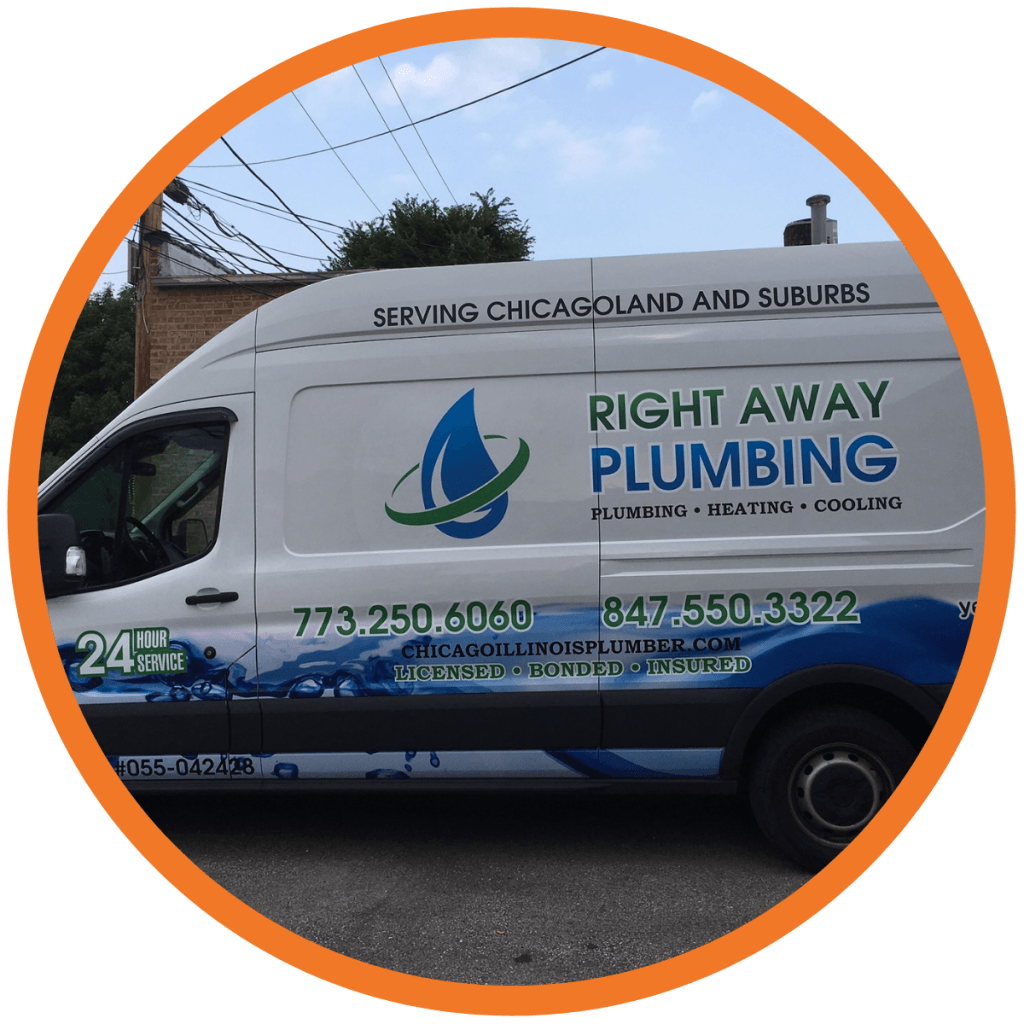
“Van graphics are particularly important for companies like plumbers, electricians, and gas engineers because most customers don’t even go to their offices.
A vehicle parked on the street while the tradesperson is working at a customer’s house can get thousands of views—so vehicle branding can be extremely beneficial as a way to get noticed.”
—Elizabeth O’Connor, Owner of FASTSIGNS-Lincolnwood.
Based in the US, they can handle all of your business visibility needs, including vehicle signage.
5. Caring for your service fleet gives customers confidence.
“Whenever I see a vehicle with signage that’s professionally designed, it gives me the impression that the business owner knows how to take care of their business.
This gives me the confidence that they’ll take care of my house when I hire them.”
—Stan Tan, Digital Marketing Manager at Selby’s.
Selby’s is an Australian printing and signage company with clients like McDonald’s and Mercedes-Benz.
6. Service van design and graphics can attract a lot of attention.
“The American Trucking Association estimates that a wrap on a trailer gets 10 million impressions every year.
If your company is often driving around town for repairs and service calls, then not adding a wrap or graphic to your vehicle means leaving money on the table and missing countless opportunities.”
—Matt Fisher, Marketing Director at Decal Impressions.
As a US-based van sign writing company, they offer full or partial van wrap designs, vehicle graphics, vinyl cut lettering, magnetic signage, and more.
7. Van graphics are cheaper than types of advertising.
“Vehicle livery is one of the most cost-effective forms of advertising.
Studies found that vehicle graphics had the cheapest cost per impression compared to other forms of traditional advertising, including television, magazine, radio, and outdoor advertising/graphics.
With vehicle graphics potentially generating over 30,000 visual impressions per day, this vehicle advertising option really does make an impact.”
—Jeff Bufton, Signs Express
8. Clear service van design can generate leads.
“No one ever walks up to the driver of a blank van and asks for their business card.”
—Barry Gibbons, Van Signs Online Ltd
What information should you give to a vehicle signage designer?
When you approach a vehicle signage designer or manufacturer, they’ll need certain information from you to be sure you get exactly what you need.
- Get the basics right and don’t forget about safety.
- Measure twice, cut once (literally).
- Choose your format.
- Offer details on what you want… but not too many.
- Show them the money!
Our experts have some suggestions for what details to think about before beginning the process.
1. Get the basics right and don’t forget about safety.
“Ensure you have high-resolution imagery, company logos ideally in vector format, and any non-standard fonts ready to keep your brand identity consistent.
Safety requirements should also be considered, such as reflective graphics for vehicles operating on highways.”
—Jeff Bufton, Signs Express
2. Measure twice, and cut once (literally).
“If you’re getting a van wrap, measure the van carefully for the space or there’s a real danger that the wrap company will stretch and distort the wrap design around door handles, taillights and headlights, license plates, and windows.
Measure for the space as though it were a picture going on your living room wall; you wouldn’t have a wall hanging going halfway across a doorway.”
—Judy Cutler, Art Director at Jess Perna Art Studio.
This US-based company creates hand-drawn digital art for vehicle signage, vehicle branding/advertising, and more.
3. Choose your format.
“Car magnets are a great option for businesses that want a quick, inexpensive way to brand their vehicles; they’re easily removable and can be used among multiple vehicles.
The disadvantages are that they can potentially fly off of the vehicle—especially if they’re not properly secured to a flat surface—and won’t stick to non-steel surfaces.
For businesses that want a more elaborate or a larger design, van wraps are an excellent option. Some of the most notable advantages of wraps are that they’re durable, long-lasting, and offer design versatility.
As far as disadvantages, van wraps can be more costly and require more maintenance than car magnets.”
—Ralph Askar, President and CEO of Instant Imprints.
Instant Imprints is a US and Canada-based leader in the apparel, sign, and promotional product industries.
4. Offer details on what you want… but not too many.
“If you have something specific in mind for your vehicle signage—for example, if you know how much of the van you want covered—it’s important to let the designer know. You’ll also need to provide basic details such as your services, contact details, company font, company logo, and brand colours.
The signwriter will know what materials will be best for each application and can make recommendations to your business.
Remember that the graphic designer is the expert, and given the right information will create the best result.”
—Matt Green, Flamo Graphic Design
5. Show them the money!
“In addition to letting us know what information you want to put on your vehicle, we would need to know the year, make and model of the vehicle. It’s also extremely helpful to know your budget.
We can provide van graphics for very simple and economical ideas, to something very complex, like a full wrap.”
—Elizabeth O’Connor, FASTSIGNS-Lincolnwood
How do you decide on the design of your van?
If you’ve got a totally white van, sign-writing ideas might even seem a bit overwhelming.
It’s a lot like looking at a blank page and wondering where to begin. To get over the mental block, it helps to break what you want to do into simple steps.
Below, we’ve outlined some of the advice from experts; their guidance can help you to think up work van designs that look attractive and professional.
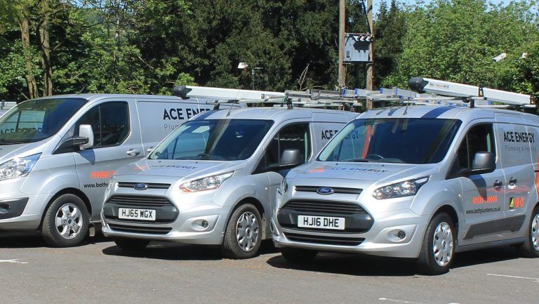
For a good visual example, check out Warm for Life’s vans. They’re a Beeston-based plumbing, heating, and gas services company that won Which? magazine’s national award for Vehicle of the Year.
- Outline your text.
- Find the right font.
- Don’t mix your media.
- Should you rethink your vehicle branding?
- Keep it simple.
- Skip the stock photos.
- Show your face.
- Make space.
- Be unique.
- Start big, go small
- Group the elements.
1. Outline your text.
“Primary colours stand out best at a distance. Also, it’s important to have a stroke, which is an outline colour, around the text; yellow with a black stroke stands out the most.”
—Judy Cutler, Jess Perna Art Studio
2. Find the right font.
“Fonts need to be simple and easy-to-read ‘paragraph text’— fonts like Futura or Helvetica are good examples. Fonts that are flashy or decorative are going to be difficult to read, especially on a moving vehicle. If the business’s branding already uses decorative fonts and low-contrast colours, you’ll need to make a compromise.
Include the low-contrast colours, but let the designer use additional colours to help them ‘pop’. Use a more legible font on the vehicle signage and add it to your business’s brand assets to be used from this point on.”
—Matt Green, Flamo Graphic Design
3. Don’t mix your media.
“Be consistent with existing branding, whether that’s on your website, Facebook, or promotional flyers. I believe it’s important in the conversion process that the customer knows they’re dealing with the right business.
Having a mix of styles across different media could confuse the customer.”
—Barry Gibbons, Van Signs Online Ltd
4. Should you rethink your branding?
“The most effective wrapped vehicles are those that have solid design and utilise good branding. This may be an opportunity to look at your brand. Does it need to be refreshed? What could you do better?”
—Matt Fisher, Decal Impressions

5. Keep it simple.
“The message should be simple. If it’s too text-heavy, for example, it will be hard to read. The most important information should be the largest and very visible; typically this is the company name.”
—Elizabeth O’Connor, FASTSIGNS-Lincolnwood
6. Skip the stock photos.
“Avoid stock photos, as they’re easy to spot and [can easily] look unprofessional. Organise a photoshoot if you’re planning on including any photography in your signage.”
—Matt Green, Flamo Graphic Design
7. Show your face.
“Businesses owners like plumbers and electricians tend to like big head/little body caricatures because they gain facial recognition. Then, when they knock on the door of a client, they’re recognised and the client is not fearful of allowing them entrance. They also get recognised in their area by people on the street, which helps with promotion.”
—Judy Cutler, Jess Perna Art Studio
8. Make space.
“Each element of the design needs space around it, which designers refer to as negative space. It gives more visual impact and makes the design look more premium.
If you add too much information, the negative space disappears and you end up with a cluttered and cheap-looking result.”
—Barry Gibbons, Van Signs Online Ltd
9. Be unique.
“Consider: What makes you different than Bob’s Electrician down the road? Will your signage stand out in a traffic jam, or will the colours blend in with the other vehicles?”
—Stan Tan, Selby’s
10. Start big, go small.
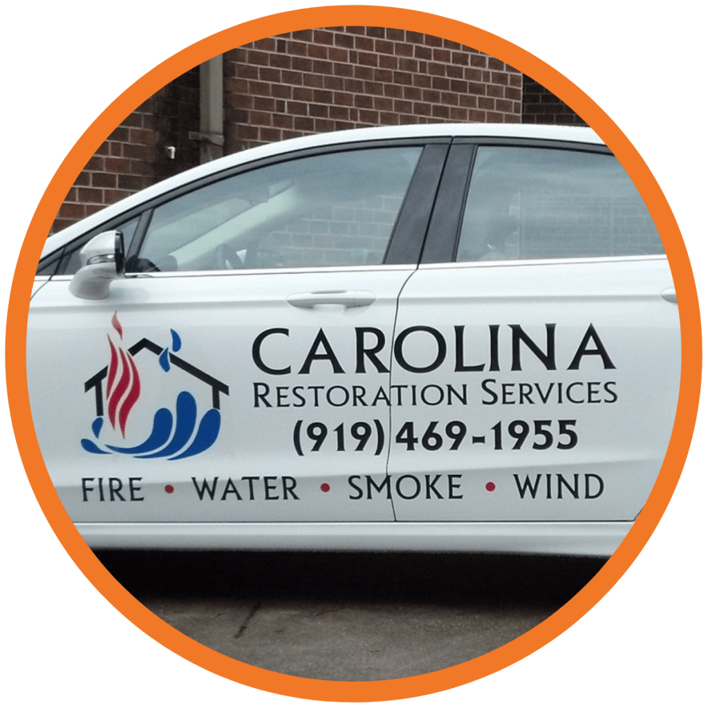
“What sizes will you need for your ad? Write up a list of potential uses: business cards, signs, billboards, truck or car wraps, door hangers, flyers, print ads, magnets, etc. It’s important to order the largest size then reduce as needed, as using a small digital file and enlarging it will make it pixelate.”
—Judy Cutler, Jess Perna Art Studio
11. Group the elements.
“Stick to one or two main colours, with a possible extra accent. Use the same colours and font style for similar elements—for example, put all contact details in the same style—and differentiate the sections of the design by using different colours/font styles.”
—Barry Gibbons, Van Signs Online Ltd
What useful information should you include on your service van design?
If you’re looking to build your brand, then improved service van designs can help draw customers in—and the business details you include are what will help them make a buying decision and hire you.
Our signage pros offer a wide variety of advice, but it’s also important to notice that they don’t all agree, showing that you have some latitude in your choices.
Take it all on board and decide what’s best for your business.
- Show your speciality.
- Appeal to your customer base.
- Eliminate the email.
- Include social only if you’re on social.
- Cater to drivers.
- Catch their attention.
- Head off expensive changes.
1. Show your speciality.
“Think about what’s most important for you to communicate; this is typically the company name, your company logo, and a means of being contacted like your website or phone number.
If there’s something special about the company that they want to promote, like 24-hour service, that would be excellent to include.
Hours are probably less important because most trades work the same hours—unless people are on-call round the clock, available weekends, or something unusual like that.”
—Elizabeth O’Connor, FASTSIGNS-Lincolnwood
2. Appeal to your customer base.
“Businesses need to consider who their customers are, and what it is about the services they are offering that would appeal to consumers.”
—Matt Fisher, Decal Impressions
3. Eliminate the email.
“The two most important details are your phone number and your website. Emails will be too long, and people generally don’t remember them.”
—Stan Tan, Selby’s
4. Include social only if you’re genuinely on social.
“If your company is active on social media (posts regularly, interacts with followers, etc.) then I would suggest adding your social media accounts. If your company is not active, then I would suggest that they do not add their social media accounts.
You don’t want to direct a customer to somewhere that’s not a good representation of your company. An inactive social media account could deter a potential customer from hiring you.”
—Matt Fisher, Decal Impressions
5. Cater to drivers.
“70% of the time people will be looking at your van signage while driving, so it needs to communicate everything as quickly and simply as possible. I would include a web address as well as a very brief service description.
If you have a web address on your van, I’d leave the social media off, but otherwise, it’s OK to include it. I almost never include a phone number on vehicle signage because nobody will remember it or write it down, but a web address is easily remembered.”
—Matt Green, Flamo Graphic Design
6. Catch their attention.
“In theory, you have around three seconds to capture the attention of a potential customer. The company name and logo should be easy to find for potential customers who may be looking at the passing van, and contact details clearly legible.”
—Jeff Bufton, Signs Express
7. Head off expensive changes.
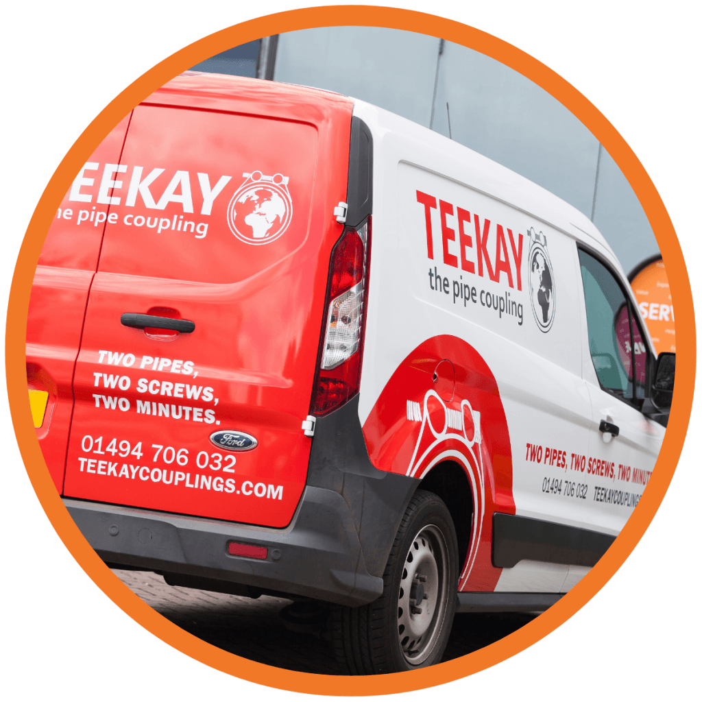
“Avoid things that are likely to change, such as opening hours or pricing. Remember that the signs will last 5+ years.”
—Barry Gibbons, Van Signs Online Ltd
The three big service van design mistakes you must avoid!
Our experts shared the most common mistakes they see businesses make when it comes to van signage ideas and vehicle advertising. Heed their warnings and don’t let your vehicles let you down!
- Don’t shop by price.
- Don’t add too much text to your van.
- Be careful to avoid typos and spelling errors.
1. Don’t shop by price.
“The main mistake is chasing the best price and assuming all signage is made equal. The materials may look the same, and when newly applied they will all look great, but it’s one, two, or more years down the line that the quality of the material shows.
Choosing the cheapest price nearly always means choosing the shortest lifespan—there are plenty of vans out there with faded out signs as they weren’t properly laminated, or with peeling off pieces or a ‘dirt border’ around the lettering where the material has shrunk back, leaving the adhesive for dirt to stick to.”
—Barry Gibbons, Van Signs Online Ltd
2. Don’t add too much text to your van.
“The most common mistake tradesmen make when getting their vehicle signage made is including way too much information. A huge list of services crammed into a small space along with all of their contact details always looks terrible and results in a jumbled mess that’s hard to read. Keep it simple!”
—Matt Green, Flamo Graphic Design
3. Be careful to avoid typos and spelling errors.
“Proofread the proof. It’s surprising how many people get their own phone numbers wrong!”
—Barry Gibbons, Van Signs Online Ltd
Can you afford to wrap vans in new designs?
Vehicle signage can be a major expense if you have an entire fleet of vans to wrap.
Here’s what our experts suggest you do to cope with the costs:
- Less is more, but don’t go cheap!
- Ask about more economical options.
- DIY your vehicle signage.
- Adjust your attitude
1. Less is more, but don’t go cheap!
“I’d say it’s better to have less signage in better quality material than to go cheap on the material in the hope of getting more on the van.”
—Barry Gibbons, Van Signs Online Ltd
2. Ask about more economical options.
“By working with an expert signs and graphics company, companies can make sure they get the most out of their budget and minimise costs whilst still making a big impact on the road.
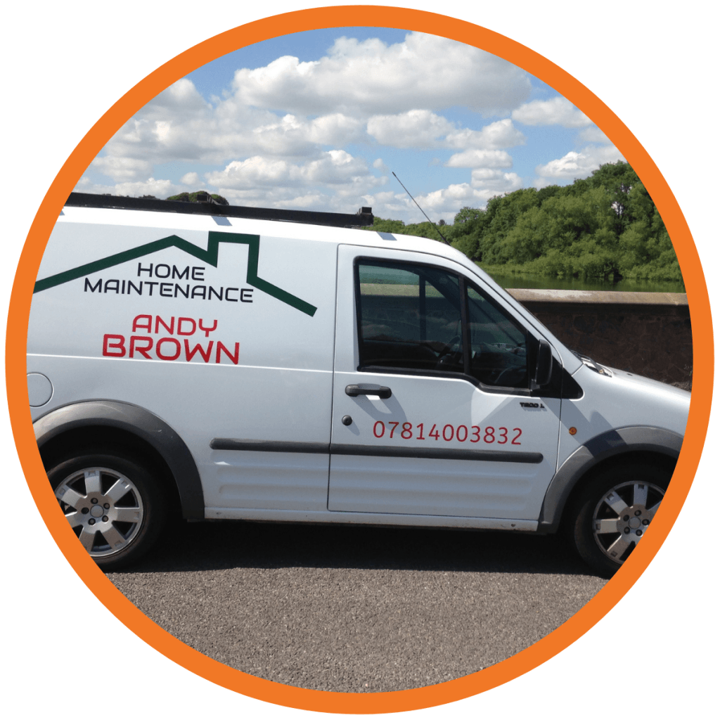
Partial wrapping, cut vinyl graphics, and clever design can create stunning results for smaller budgets.”
—Jeff Bufton, Signs Express
3. DIY your service van design.
“Self-fitting is a good option. The fitting is easy compared to the work most tradespeople carry out day-to-day. It saves money, meaning reduced cost or better materials.
Also, the fitting can be done as time allows, meaning your van doesn’t have to be off the road while in the hands of a sign company.”
—Barry Gibbons Van Signs Online Ltd
4. Adjust your attitude.
“Here’s the thing: If you’re improving your business in any way, it’s an investment, not an expense.
Professionally designed vehicle signage increases your brand awareness and will help you get more customers, so the investment is going to be reclaimed easily.
It may only take a couple of jobs to recoup the entire spend.”
—Matt Green, Flamo Graphic Design
Can a service van design refresh influence sales?
Only you can forge your brand’s identity!
Whether it’s time to redesign your vans, or if you’re starting out from scratch, the tips above will help you attract new customers and create a strong brand identity.
Of course, getting your customer’s attention is just one part of the successful sales process. To find success, you’ll need to create comms and use proposal management software to create proposals that match the quality of your branding.
And we can help there, too…
Commusoft has created an field service management software and Sales CRM to enable your business to manage all the new leads your eye-catching vans will no doubt send your way!
From tracking fresh job opportunities, to managing your sales pipeline, and even building beautiful proposals, Stop Quoting, Start Selling, today:

